In-depth interviewsSynthesizing InsightsCrafting the solutionUsability testingProject outcomes

Interactive menu app "Woo Thai"

Overview

A lot of restaurants now use mobiles to share their menus with their guests. All of them are built differently, have different information, and have different options to take action with. Some choose to create a website and share their menu there, some create an app like Mcdonalds' or Starbucks. The main thing stays what is better for a user and what they need. No previous studies were conducted for this project.

Problem

Guests spend too much time waiting for the menu at the restaurant.

Goal

Design the app for Woo Thai that allows easy getting menu, checking all needed information about the dishes, and asking for a waiter to the table.

Role

UX/UI Designer

Duration

4 months

Responsibilities

Research plan creation, Conducting interview, interview transcription, Data structuring, Storyboarding, Persona creation, User journey mapping, paper and digital wireframing, prototyping, usability testing, mockuping.

Exploring user needs via In-depth interviews

I conducted interviews with 5 people who regularly visit Woo Thai Restaurant to better understand and empathize with the users. I asked them when they usually go to the restaurants, and how they decide where to go. I asked them to describe one of their woo thai restaurant visits and the problems they are experiencing.

Storyboarding key interview findings

Collected information helped me to create a big-picture storyboard that illustrates the most common User journey and highlighted places where the pain points occur. It also helps me to represent users’ points of view during the project and its later stages. Research also revealed that the time spent waiting for a menu at the restaurant was not the only factor limiting good impressions from a restaurant.

Image of created big-picture storyboard.

The reliability of the data depended on the questions I asked and how I guided the conversations. Since this was the initial stage without prior research, for future projects I aim to include a larger number of participants and invest more time in collecting information. This approach will help build a more solid foundation for dependable insights.

Problem statement

How might we create an engaging and easy to use application, that makes time spent in restaurant more productive and helps users with decision making process?
Synthesising Insights: from personas to pain points

A primary user group identified through research was working adults who want to experience new sensations from going out to restaurants and prefer eating in the middle price category.

Personas

Restaurant visitors had a common age but different goals for restaurant visits. Some came to get their meals because they didn't want to cook at home or couldn't do it. Others visited restaurants as a sort of entertainment, to spend time with the close ones, create content for social media, and spend time out of the house. Those two groups paid attention to different aspects of their ordering User journey and experienced different problems.

User problem: Cognitive overload in user’s journey

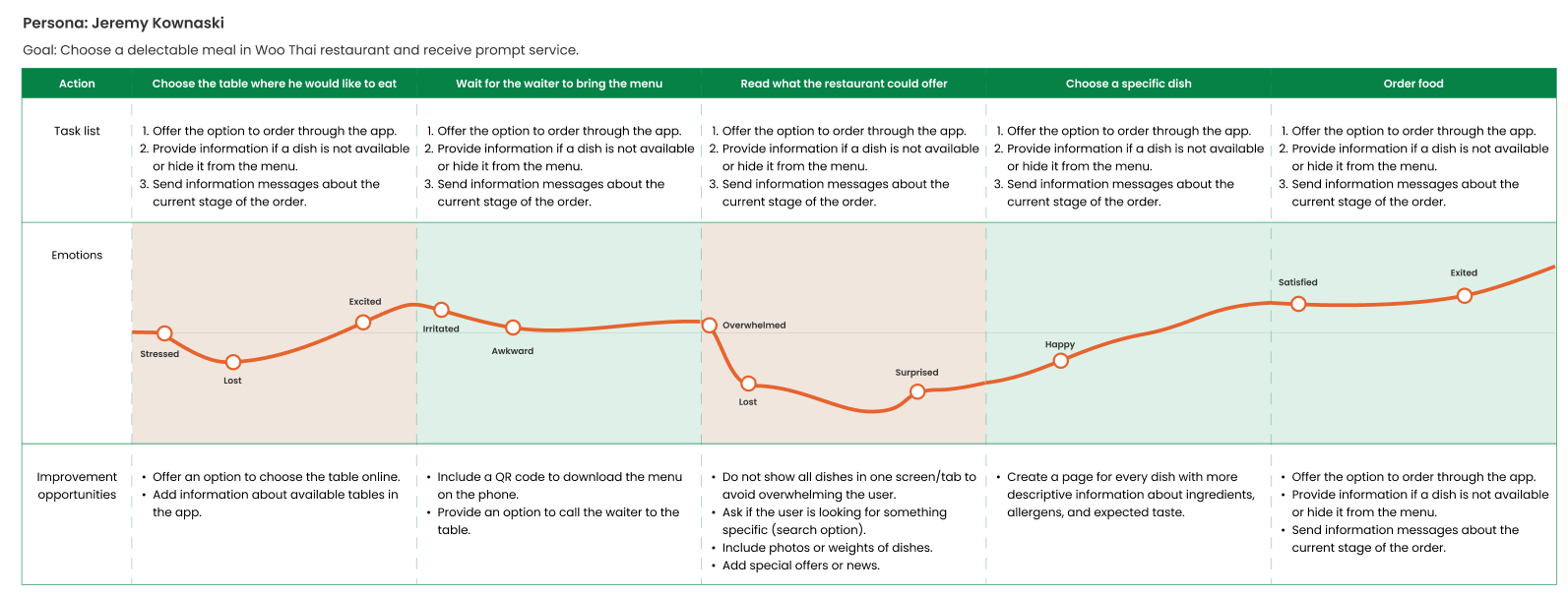
To have an understanding of users' interaction points during the whole restaurant visit I mapped the User journey. It helped me to explore their interactions with the menu and find the unpleasant process gaps that can be solved with the offered product.

During the ordering process in restaurants, lots of negative feelings can appear. Decision-making is a difficult cognitive process for humans, and when it is combined with social interactions that usually restaurants have, it makes things extra complicated for people. Their minds are juggling a bunch of different tasks at once.

Knowing all this information, it's no surprise that many restaurant visits end up with people having a not-so-great opinion or a not-so-awesome experience. And It's not always about the taste of the food – there's more to it.

Pain points
Time

Working adults are too busy to spend too much time in restaurants

Information

The lack of knowledge about the ingredients of dishes causes fear of trying new unknown dishes

Accessibility

Regular menus are not adapted to the needs of tourists who do not speak the local language

Crafting the solution

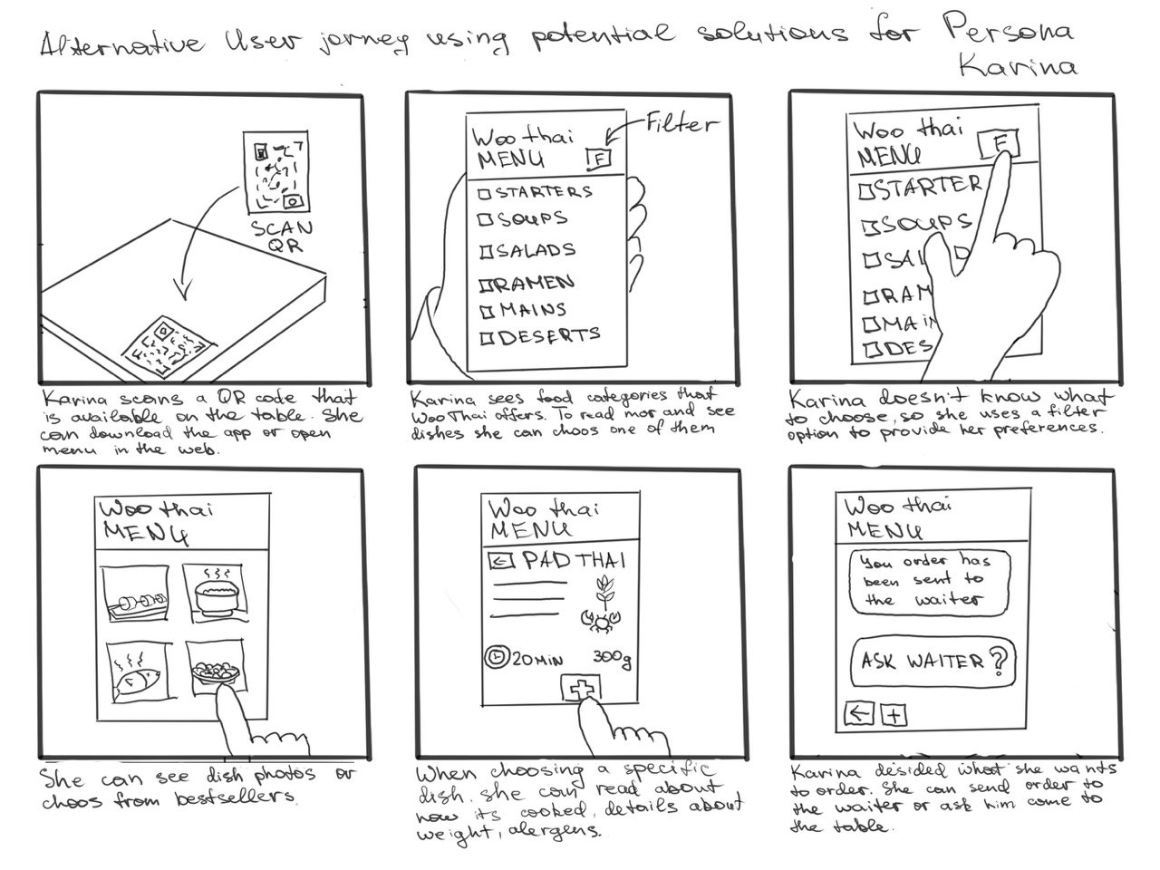
I used storyboarding as my ideation technique. I introduced my ideas in the form of a scenario for one of the Users that potentially can help to avoid the problems they faced before. Also, I used the journey map I created before and connected solutions with each journey stage.

Application features
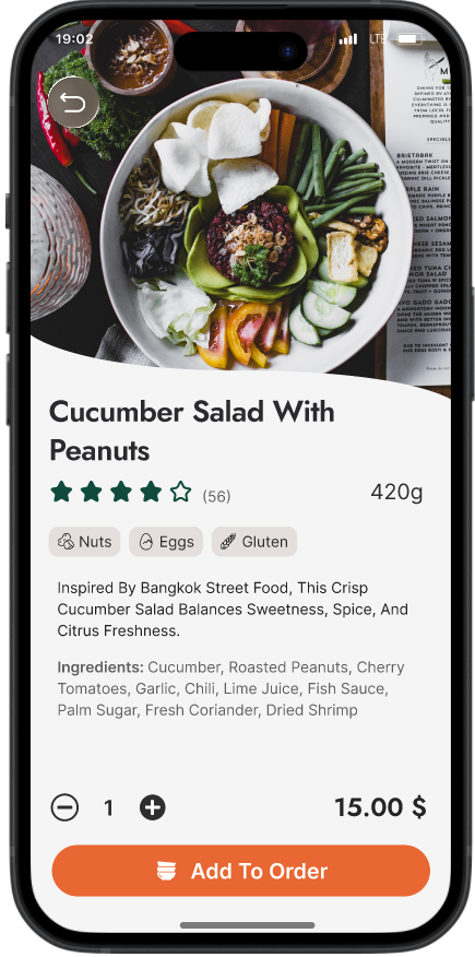
  • Organize dishes in a categories and give the opportunity to dive deeper into a description by opening a new screen if needed.

  • Food photos, special offerings from the restaurant to guide the user and make a decision making easier for them.

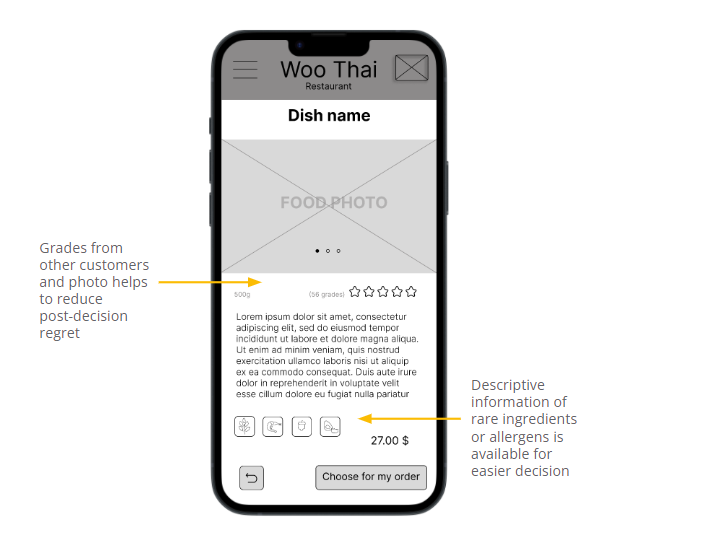
  • Descriptive information about ingredients, portions size, allergens, expected taste, to limit the number of unknowns as much as possible and limit post-decision regret.

  • Filter option for the users who have preferences or food restrictions.

  • Choose the table online or display information about free tables and how they are located.

  • Hide not available dishes or informing if the dishes are out of stock.

  • Information about what stage the order is in currently.

Starting design

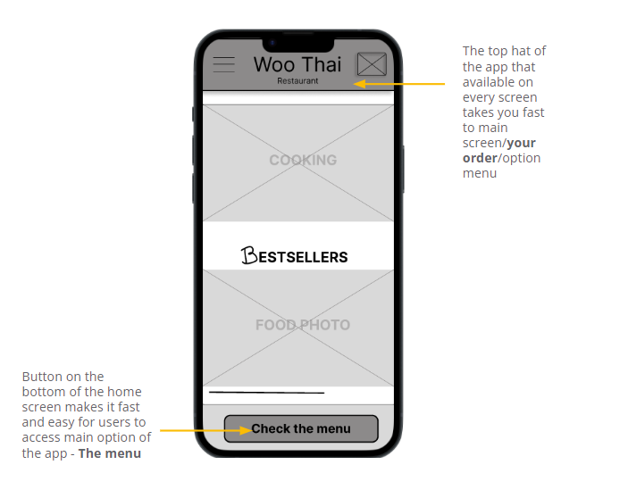
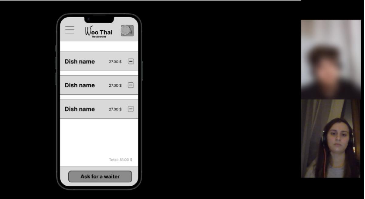
Here I started creating wireframes and adding the solutions to the product. I made sure to base screen designs on findings from user research.Here also appeared the first version of the Lofi prototype for the application. The prototype included the primary user flow of reviewing and choosing the dishes and was used in a usability study.

Usability Testing

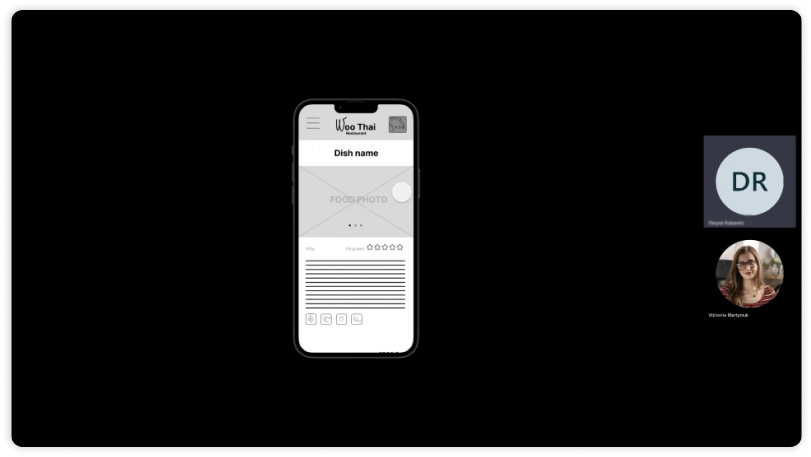
In this stage, I created a detailed research study plan. I gathered a focus group to test the early product version. The primary objective of the research was to check how easily users complete core tasks within the design and to collect insights on how to enhance the product.

What's the isights?

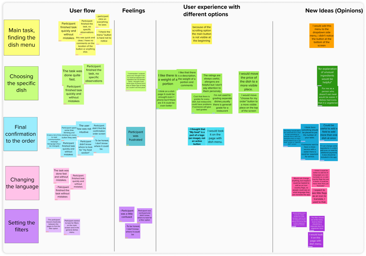
Users provided valuable insights about the filter settings, order confirmations, and the whole waiter-handoff process. Some participants admitted navigating through these tasks felt a bit off for them. They stated something like: "I'd look for it on the page with the dish menu." or "To be honest, I don't know where it could be."

  • 5/5 part. had issue finding the filter option in the app.

  • 3/5 par. asked about the icon of "translate" option.

  • 4/5 par. couldn't find the "my food" button because of it's visual design.

  • 2/5 par. took a lot time to read and understand the confirmation communication after actions.

  • 5/5 part. were looking for a food menu in the side (option) menu.

  • 2/5 part. noted that 1 photo of the dish is enough to know if they want to order it or not.

Round 1 findings
  • The filter option should be available both in the general menu screen and in the specific category menu screens.

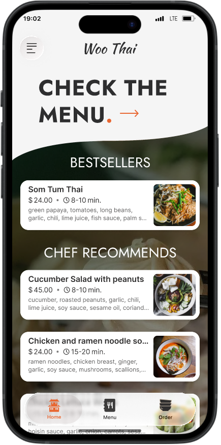
  • The main button “Check the menu” should become more visible.

  • Finishing the user journey is too complicated and should be more intuitive.

Round 2 findings
  • The option of getting back to previous screens should be corrected.​​​​​​​

  • Screen with empty ordering box and communication screens should be added.

Negative emotions were still present in the user journey. It wasn’t very good, clearly, I've got some tweaking to do.

Back to design

Mockup

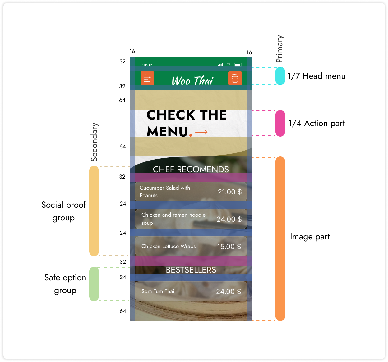
After the usability testing, I refined the color palette to make the app visually pop. I also played around with the menu button, shifting it to the top, based on the information priority theory.

Design iteration 3

Project outcomes

After working on this project for three months, I gained a solid understanding of the food ordering process. This knowledge laid the groundwork for developing an application with well-considered functionality. However, in retrospect, I believe I would approach the visual design differently next time, incorporating the UI skills I acquired during this period, especially in terms of enhancing design accessibility.

Key takeaways

The research certainly made a great contribution to the understanding of real User problems during this project. I‘ve learned valuable information that helped me tailor applications to solve the right problems.

Think from different users’ perspectives. Explain more - prepare better.

When I conducted usability testing, I found that for non-IT professionals it can be challenging to use low-fidelity prototypes. Not everyone knows what a placeholder means or basically why it is black and white. I learned that even low-fidelity prototypes should be clear enough to understand for a person who doesn't know anything about the project.

Sometimes you need to read between the lines.

During interviews and user testing, people felt like part of the team. Instead of just sharing their experiences, they often suggested solutions. I realized, that probably it is my responsibility as an interview moderator to lead the conversation in the right direction and I have to work on that in the future. However, by providing suggestions, users also give some sort of information about their needs - it just has to be interpreted correctly.

Next: Internet Trust

Continue