
Which aspects of the search experience have the biggest impact on satisfaction and abandonment?
This project focused on improving the search experience on a vacation rental platform used by travelers across the U.S. The platform hosts thousands of rental properties and powers booking websites for local tourism organizations. While each site has its own look and branding, they all rely on the same shared search engine and property database.
The goal of this project was to evaluate the search experience: identify the main reasons for negative experiences, understand why users abandon or struggle, and determine which filters and UI patterns would help guests quickly find a stay that suits their needs.
There was no prior research showing how travelers actually use the search engine, what difficulties they face, or which features are missing. Without this understanding, it was difficult for the product team to prioritize improvements or know which parts of the search experience matter most to users.
UX Researcher
2 months
Research planning
UX audit
Session review
Survey design & analysis
Competitor analysis
Insight synthesis
Recommendations
I prepared a research brief, aligned with the Product Owner on goals, and defined research questions to guide the study.
I ran a heuristic audit of the search results and property pages, and reviewed Hotjar sessions to spot usability issues and abandonment patterns.
I designed and deployed onsite surveys across four DMO sites, collecting over 10,000 responses in 8 weeks to measure satisfaction and capture reasons for frustration
I compared filter models and search flows from six rental platforms to identify best practices and gaps relevant to our users.
I proposed UI and content changes for price display, filter confirmation, map layout, and new filter categories. Early improvements on a test page already showed higher satisfaction compared to control pages.
During the planning stage, we outlined key research questions that could help address the initial problem and guide the study. These questions shaped the choice of methods and ensured that each step stayed focused on the core challenges.
How do travelers currently use the search engine across DMO websites?
What difficulties or frustrations do they encounter during the search flow?
Which filtering options are missing or insufficient for decision-making?
What are user expectations compared with filter models and patterns on competitor platforms?
Which aspects of the search experience have the biggest impact on satisfaction and abandonment?
I began with a heuristic audit to map out potential usability issues before moving into deeper research. This helped highlight where the interface might cause friction, such as property card layout, grid readability, and search component interactions.
Next, I reviewed Hotjar sessions to validate these assumptions against real behavior. This revealed mismatches between design intent and expectations — for example, users often overlooked the map view or spent too much time on property details.

Session reviews showed what users did, but not why they made those choices or dropped off. To collect this information, I designed onsite surveys.
The surveys appeared on four DMO websites and asked if users managed to find what they were looking for and to rate their experience on a 1–5 scale. For ratings of 3 or lower, a follow-up screen presented predefined reasons such as price differences, lack of filters, slow results, with the option to select Other and add a comment. This combination allowed me to collect structured quantitative data while still leaving room for unexpected issues.
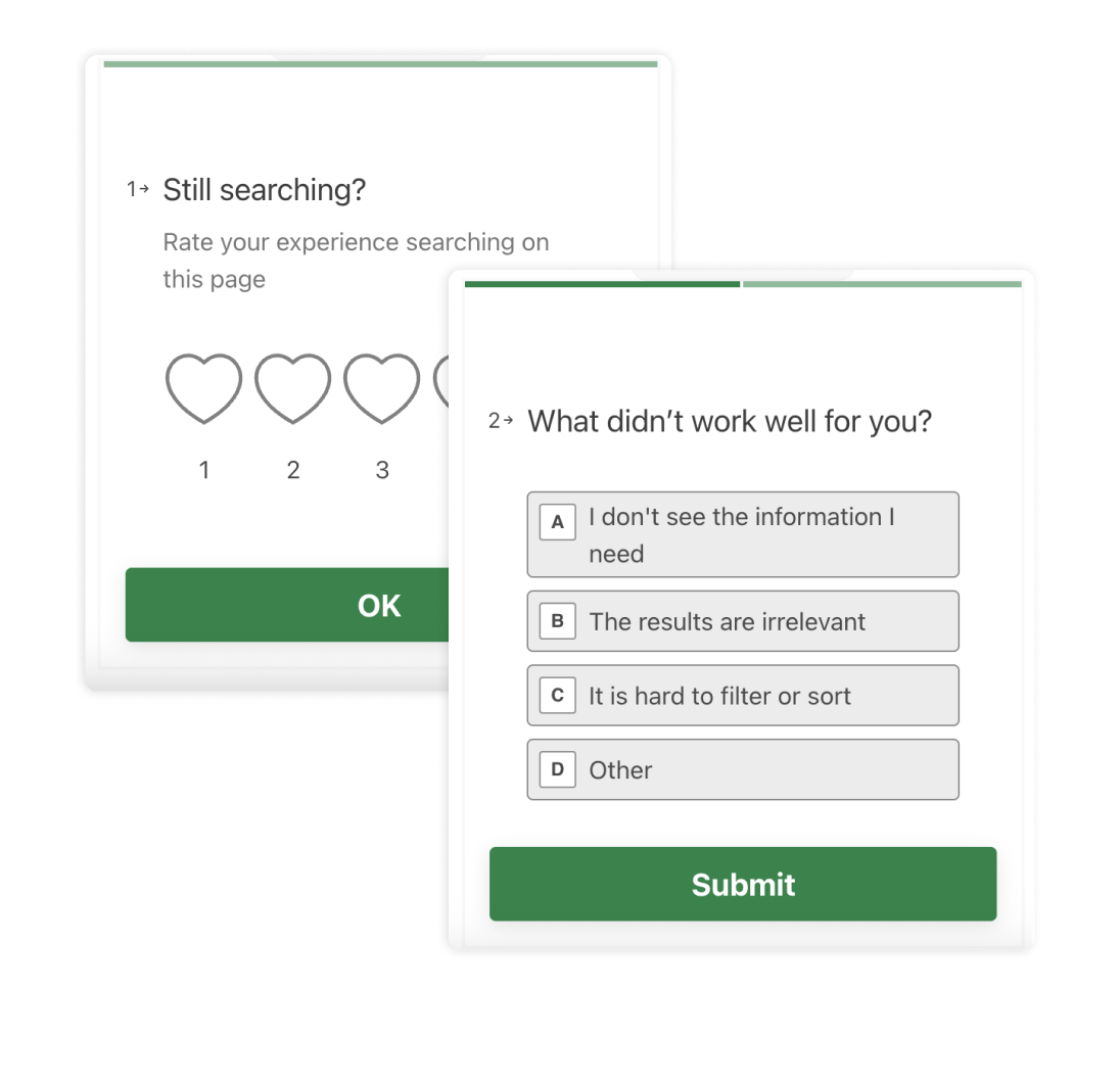
After four weeks, I combined the results from all four surveys into one database. Closed-ended selections were grouped into categories, while open-text answers were tagged with thematic codes. This allowed me to transform qualitative input into quantifiable data points and compare their frequency with the predefined categories, which made the results easier to integrate during synthesis.

The surveys quickly highlighted recurring pain points that explained many of the drop-offs we saw in behavior data. The most important insights were:
To improve performance, the search results showed only the base nightly rate without fees. On the property page, the price suddenly appeared 30–40% higher. Users felt misled and confused, and many abandoned the flow. This was a biggest factor behind lost conversions.
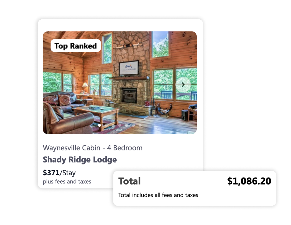
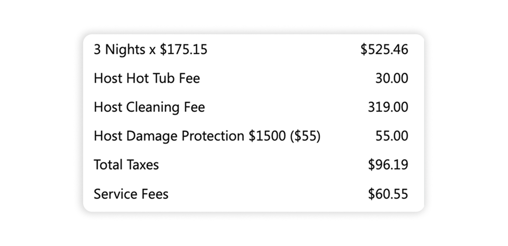
The platform displayed every fee separately, aiming for full transparency. Instead of helping, this overwhelmed users and made them question costs they could not avoid, such as cleaning or administrative fees. Travelers preferred to see a higher base price with fewer add-ons. This approach created hesitation and reduced willingness to book.
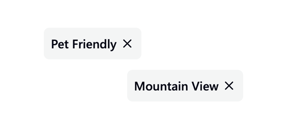
Filtering criteria were not visible on the property page
Although the system correctly returned only filter matching properties during search - the confirmation wasn’t always visible once users opened a property page. For example, people searching for pet-friendly stays couldn’t find that label in the property details. Without reassurance, they doubted the results and left to continue searching elsewhere.
Many travelers wanted to start their search by location and clicked “Map view.” However, the map was pushed below a block of highlighted listings, so most users assumed the feature wasn’t available. This caused frustration. The recommended change was to place the map directly alongside results and make the toggle more noticeable.
One of the most common reasons for low survey ratings was “I don’t see the information I need.” In open comments, users listed a wide range of missing filters, from bedroom count and bed type to accessibility, family policies, and proximity to activities. To better understand how these filters could be structured and prioritized, I conducted a competitor analysis. In parallel, we also launched a second survey iteration to collect more details about filters.
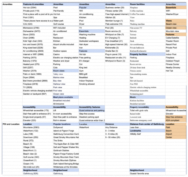
I reviewed six rental and accommodation platforms, focusing on how they grouped, named, and ordered filters. We prioritise only the filters that mattered most to users and were also supported by competitor benchmarks, rather than trying to introduce every possible option.

Bed type was an important factor in choosing a property. Some preferred larger beds for comfort, while others wanted familiar options like a king or queen.

Families cared about where children would sleep, while older travelers looked for bedrooms on the ground floor. Without this info in photos or plans, it was hard to judge if a property was a good fit.

Travelers with mobility needs (step-free entrance, ground floor, wheelchair access) often couldn’t confirm if a property was suitable. This uncertainty made booking decisions difficult.

For some guests, location was the main driver: close to hiking or fishing spots, near the airport, or with a mountain or beach view. If this wasn’t clear in search, they switched to other listings.

Guests wanted properties that clearly matched their group type — family-friendly, seniors-friendly, or adults-only. Lack of clarity here led to wasted time reviewing irrelevant options.
Based on the insights, I proposed a set of changes aimed at improving clarity, consistency, and ease of use in the search experience.
Align prices between search results and property pages.
Simplify fee breakdowns into a single line.
Make filter selections visible on property pages
Improve search component interactions and grid layout.
Add and restructure filters (bedrooms, bed types, accessibility, location, travel groups).
Place the map view in immediate visibility.
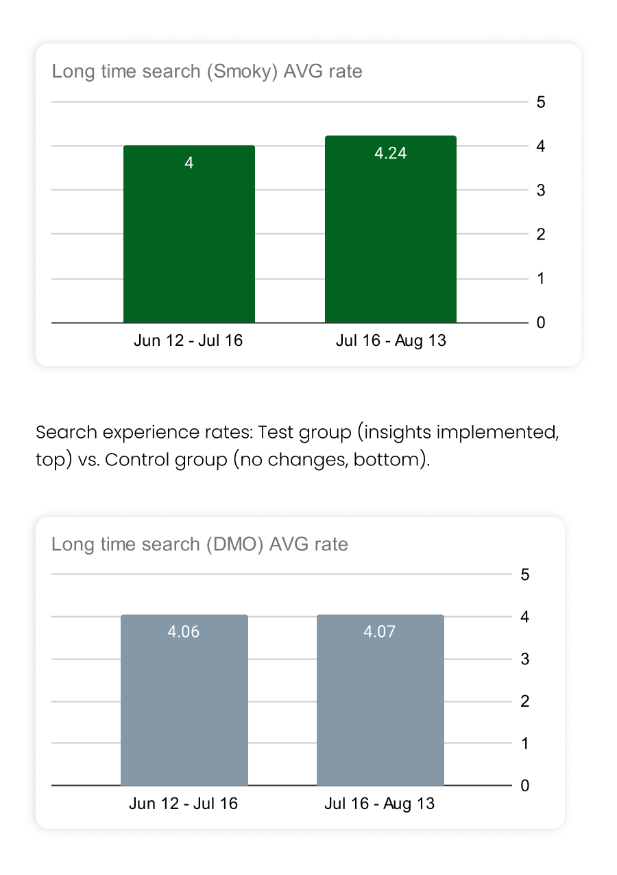
Some of these improvements were implemented between the first and second survey iterations on one of the pages. Early results showed a steady month-by-month increase in satisfaction scores, confirming the positive impact of the changes. However, the biggest pain point — price discrepancy — remained unresolved by that time, and its negative effect was still reflected in the second survey results.
Next: Apartament rent web platform